What to do
Ensure that colour is not the only means of conveying information.
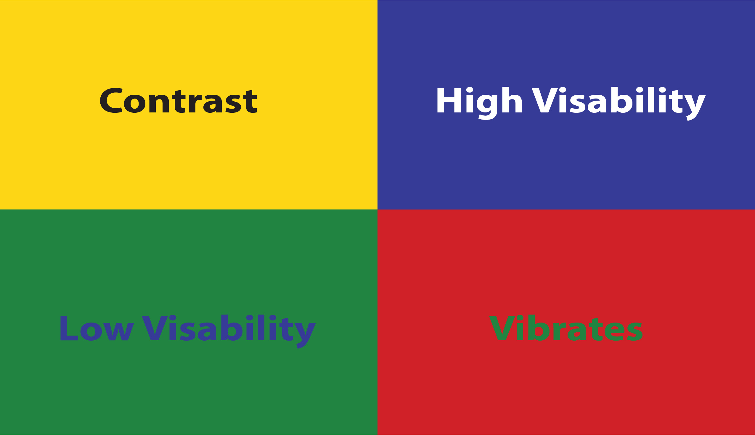
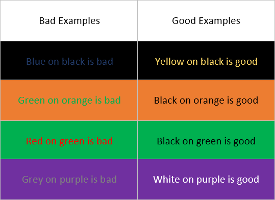
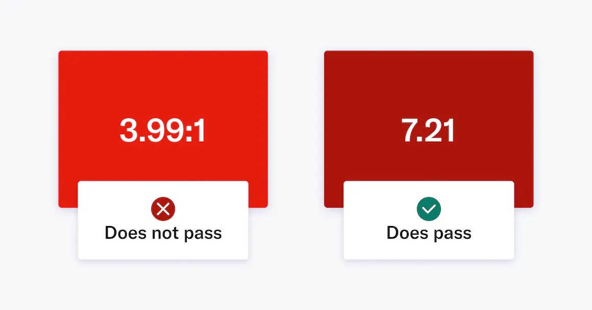
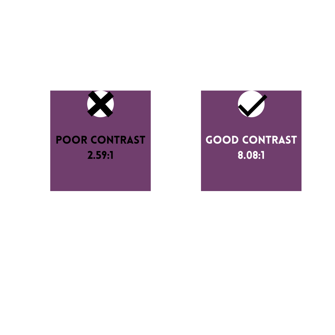
Use sufficient contrast for text and background colours.
Avoid white backgrounds.
Do not use colour solely for decoration.
Be aware of colour blindness.


How to find it
To find insufficient colour contrast, use the Accessibility Checker.
You can also look for text in your document that’s hard to read or to distinguish from the background.
Avoid placing text over images.
Why do it
People who are blind, have low vision, or are colour-blind might miss out on the meaning conveyed by colours alone so use other distinguishing factors too.
If your document has a high level of contrast between text and background, more people can see and use the content.
How to do it
Tools for checking colour and contrast
For any guidance regarding colour and contrast, please have a look at this Cribsheet that explains everything in detail.
For more information and resources please visit Microsoft Accessibility Video Training.