What to do
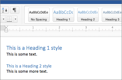
- In Word use the built-in headings and styles.
- In PowerPoint use slide titles and set a reading order for content in your slides.
- Ensure the correct use of fonts and formatting.
- Use san-serif fonts and avoid using cursive fonts.

- ONLY CAPITALISE IF NECESSARY
- Use bold text for emphasis and avoid italics and underlines.
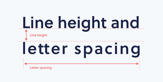
- Use 1.5 line spacing in documents and slides to make the text more readable, especially in large paragraphs.
- Use letter spacing to make it readable and ensure the letters do not touch each other.

- Avoid multiple columns and centre and fully justified text.
- In PowerPoint avoid text boxes instead use placeholders as these are read by screen readers.
How to find it
Heading styles are in the Home tab on the ribbon in Microsoft Word. Using these you can add a heading.
In PowerPoint, you can use the bring to front and send to back options to create a reading order. You can then check the reading order by using the tab key to tab through the content order in each slide.
Why do it
To make it easier for screen readers to read your documents in a logical order.
Organise the information in your Word documents into small chunks with headings and sub-headings. Ideally, each heading would include only a few paragraphs so the information is better organised as well as easier to read and understand.

In PowerPoint, a screen reader reads through content using the reading order. This also works when a PowerPoint is saved as a PDF.
How to do it
To check that the order of slide items you have added is logical, you can use the Reading Order pane in PowerPoint.
Improve accessibility with heading styles
Create slides with an accessible reading order
For any guidance regarding Structure and Layout, please have a look at this structure and layout crib sheet that explains everything in detail.
For more information and resources please visit Microsoft Accessibility Video Training.